Improving ChatGPT’s UX.
Improving ChatGPT’s UX.
Improving ChatGPT’s UX.
I am closely following in everything to do with AI, and ChatGPT is a product that I observe and use a lot. When they launched their first mobile app version I immediately wanted to try it out. And here is what happened!
I am closely following in everything to do with AI, and ChatGPT is a product that I observe and use a lot. When they launched their first mobile app version I immediately wanted to try it out. And here is what happened!
I identified many navigation issues who differs from mobile-standard browsing.
I identified many navigation issues who differs from mobile-standard browsing.
While using ChatGPT the first time, the navigation immediately got my attention: it was not a natural path to go from a chat to the chat history or even to create a new chat or exit one.
I felt a huge frustration using the product on mobile with that non-mobile navigation pattern.
While using ChatGPT the first time, the navigation immediately got my attention: it was not a natural path to go from a chat to the chat history or even to create a new chat or exit one.
I felt a huge frustration using the product on mobile with that non-mobile navigation pattern.
Registration Flow.
Default Portfolio with Top 10 assets of the year when empty.
Basic Asset listing and consultation.
Detailed asset page, with an access to the yearly evolution.
Improving the navigation and the overall experience using native navigation patterns.
Improving the navigation and the overall experience using native navigation patterns.
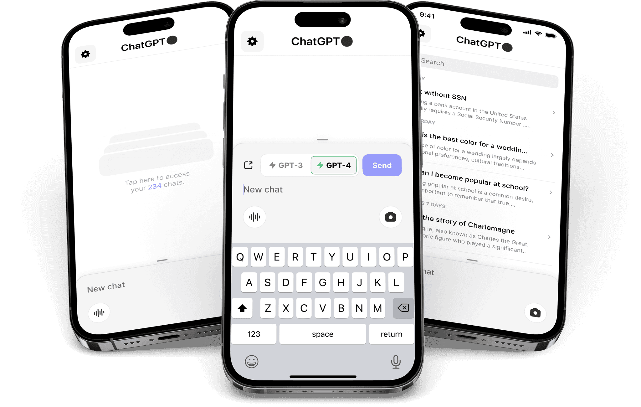
I decided to redesigned the app adding a stronger emphasis on the voice and photo addition to a chat, for a mobile usage I like to be able to dictate easily. I also rethought the way the navigation is build, making the homepage the chat history and creating a new chat opening a new page where you can quickly exit from by swiping to get back the previous page.
Here are some Before / After screens:
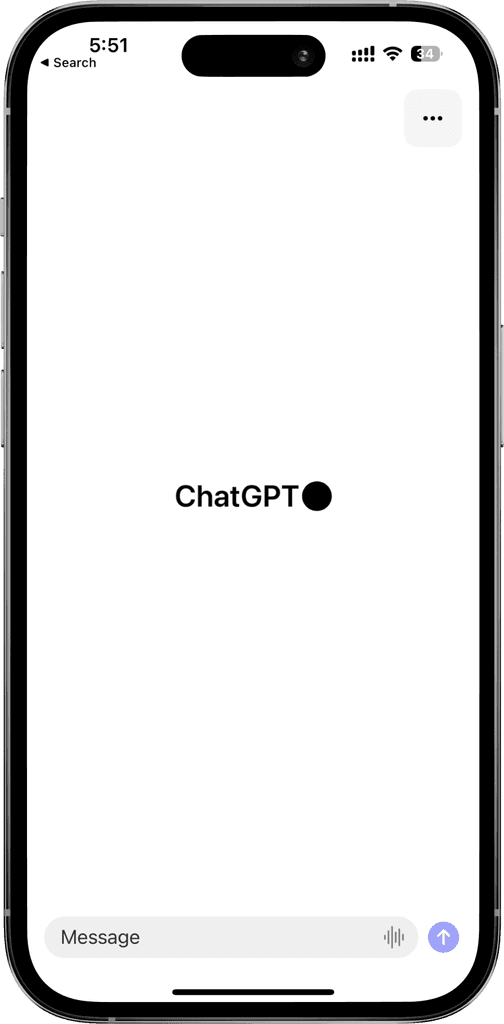
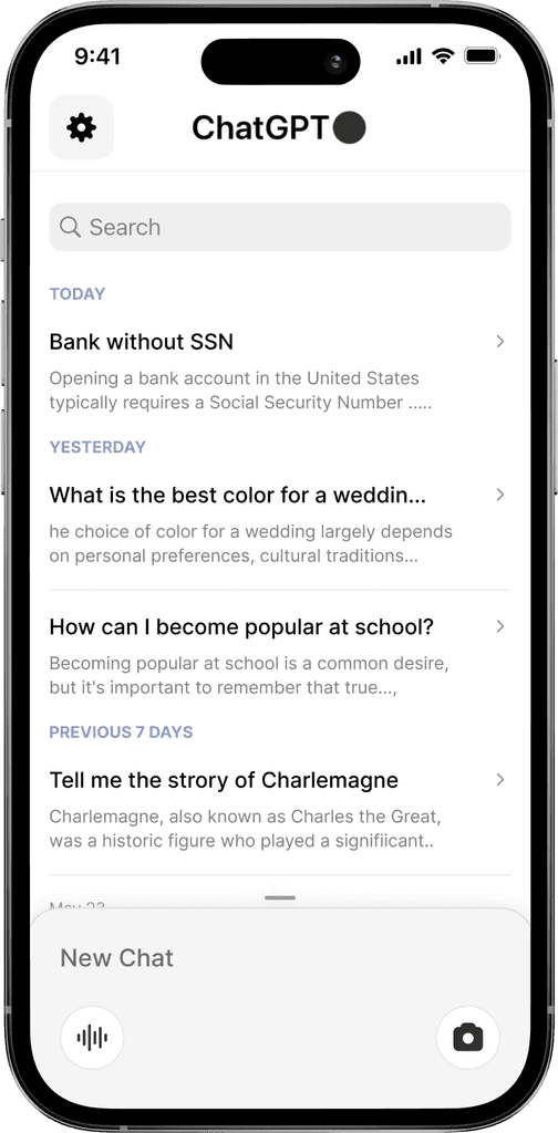
Current Homepage
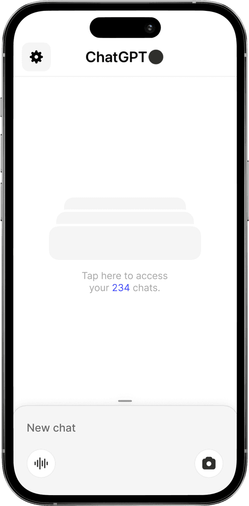
Redesigned homepage
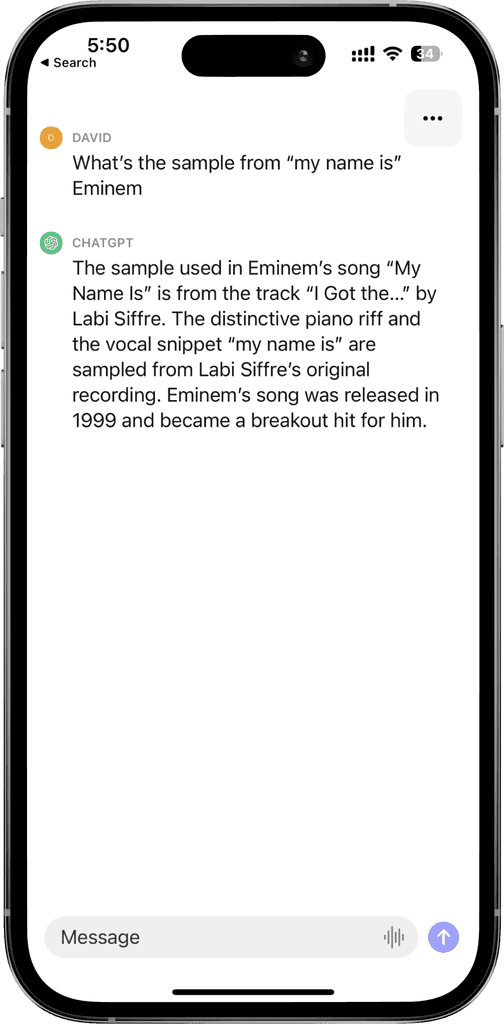
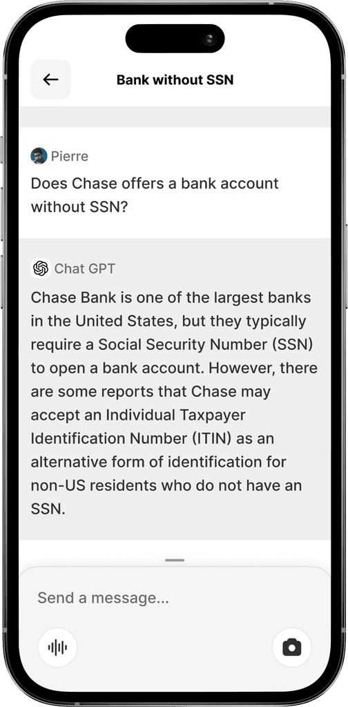
Current Chat page
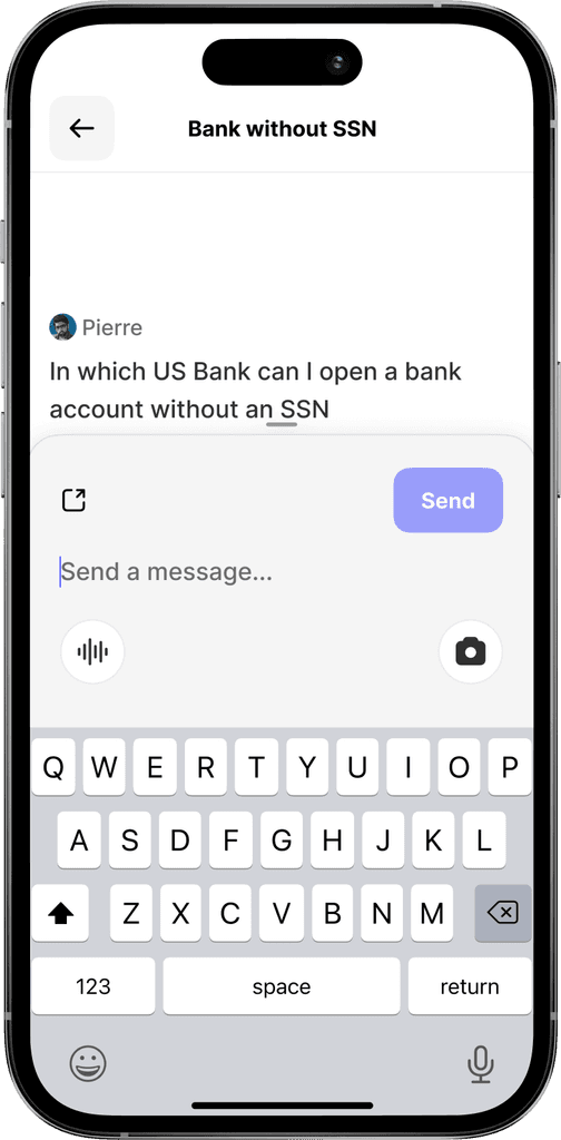
Redesigned Chat page
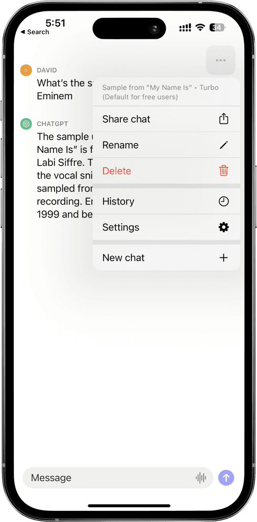
Current Chat Page Menu
Redesigned exit / New Chat navigation
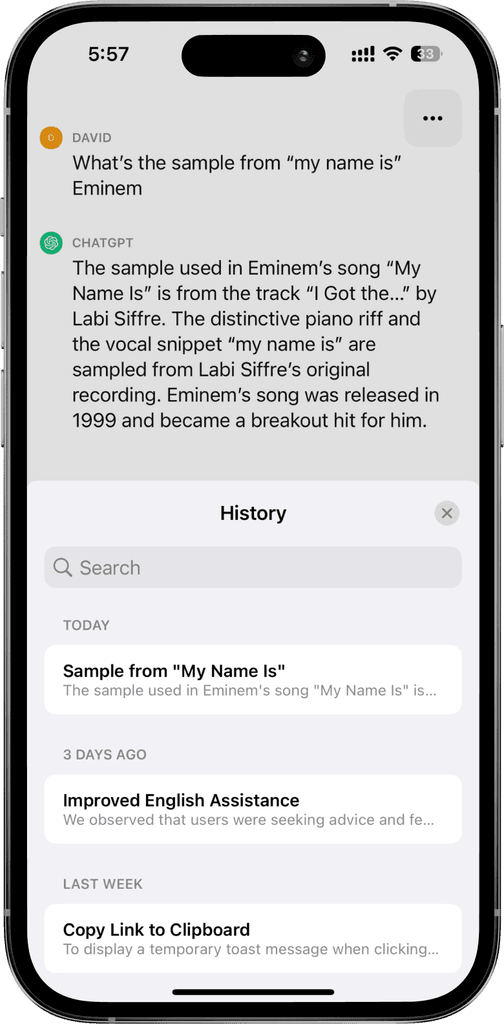
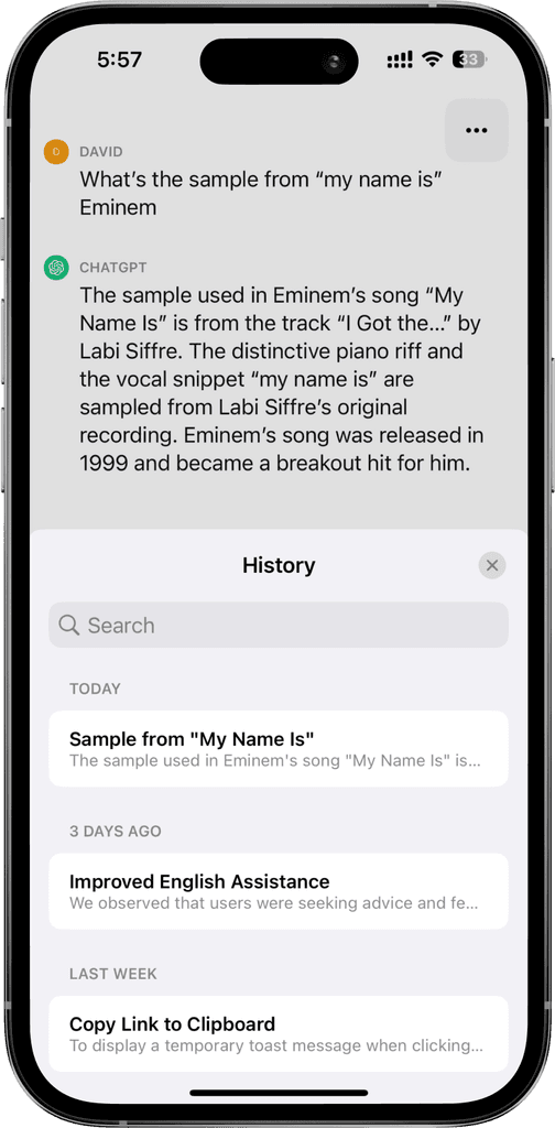
Current History
Redesigned History page
Prototyping the solution to confirm
a seamless flow.
Prototyping the solution to confirm
a seamless flow.
I decided to not display the history at the app opening, to let the user focus on the prompt he wants to make at that moment. Most of the time users open the app to create a new chat and not to dive into one the already close. This doesn't mean that the user can't access it quickly by clicking on the middle of the screen. In addition, it is displayed as soon as the user leaves the chat he has just created.
I decided to not display the history at the app opening, to let the user focus on the prompt he wants to make at that moment. Most of the time users open the app to create a new chat and not to dive into one the already close. This doesn't mean that the user can't access it quickly by clicking on the middle of the screen. In addition, it is displayed as soon as the user leaves the chat he has just created.
Prototype
coming soon
Complete flow of the app showing how you can navigate through all your prompts and create a new one quickly.